From a user interface (UI) design perspective, a form is an element that allows the user to send information to a server. Comparatively it is similar to a physical sheet of paper that you fill, while you are a bank or a post office etc.
The form can contain buttons, text fields, images, checkboxes, radius buttons and drop-down lists. Managing text fields and drop-down lists can be a daunting task with respect to availability of space, error reporting etc.
Input Types
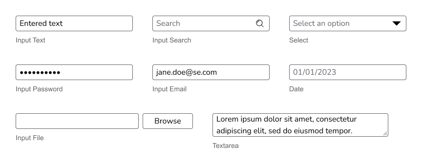
The Quartz Design System includes many different input types for forms. Some examples include:
- Input Text
- Input Search
- Input Select
- Input File
- Textarea

Input Sizes
Most of these input components come in three sizes:
Form Row Templates
To create forms, inputs are combined with a label and message to create a form row. These are each saved as components.
There are three layout structures defined to create forms:
- Vertically Stacked
- Horizontally stacked label and text field, with a vertically stacked message
- Horizontally Stacked label, text field, and message
Creating a Form
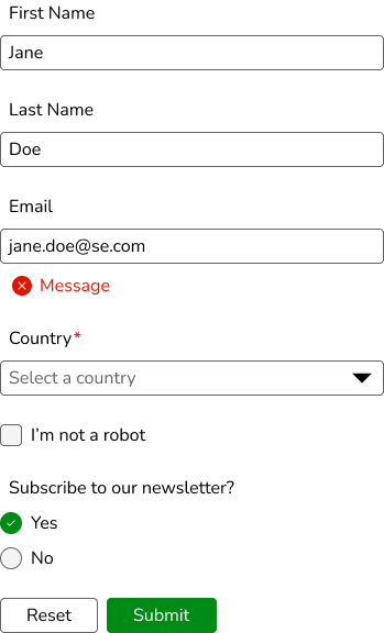
Form rows are then combined to create a full form. The following is an example of a form using vertically stacked rows:

Form Actions
Actions are added to a row at the bottom of the form. The row is aligned left by default. Related buttons are placed in another group, with the desktop.control.standard.gap.siblings.related gap (8px).
The primary action should be an emphasized button. Only one button in a group should be emphasized. The others should all be the default(standard) importance level. The primary button is also the right-most button in L-to-R languages.
Learn More
Figma Templates for the forms can be found in the Templates Figma file