Color

The User Interface color palette is an extension of the Schneider Electric palette.
Color expresses our brand values, and makes the user interface easy to understand by creating a visual hierarchy, differentiating information, and drawing attention to specific elements.
Signature
The signature colors identify the Schneider Electric brand. The signature colors are part of the brand assets and are used in the Schneider Electric logo system.

Original Signature colors: SE Logo Green and SE Life Green.
Usage in Applications
As an extension to the global brand identity, signature colors are used in the initial experience: application icon, splash screen, login and registration windows.
Within the application, signature colors are used parsimoniously and concentrated in the interactive elements of the interface. Thus reinforcing the idea that the brand is full of energy, reactive and lively.

Signature Green used to highlight core interactive elements on a screen.
To facilitate the different interactions and variants of each component, the signature palette has been extended:

With a distribution on dark and light themes in mind, color contrast ratios within each theme are respected:

Signature colors distribution on light and dark theme.
Theme
The theme is a combination of color palettes and attributes. The app theme should always follow the user's operating system' settings. Our themes are mainly composed of neutral and greyscale colors:

Full theme palette ranging from pure white to pure black.
Theses colors are distributed between light and dark modes:

Signature colors distribution on light and dark theme.
Colors are set for UI elements to create depth in the screen and to bring forward the most important ones.
Status
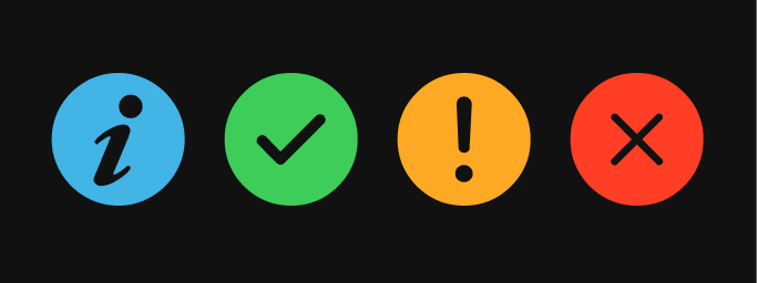
Status colors accentuate the message behind certain types of information.

Colors can be interpreted differently depending on the culture and industry. Also, some users who suffer from vision deficiency like color blindness might have difficulties to differentiate certain colors (especially red and green).
For these reasons, use of status colors should always be accompanied by a symbol (shape) or text (description). Refer to the Accessibility guiding principles for additional guidance.
The Feedback design patterns are also promoting proper use of color to convey status and feedback.
More Colors
Further color palettes are available per domain of application. The list below is not exhaustive and might evolve over time.
Alarms
This color palette represents alarm levels. For further information, please refer to the Alarms section (TODO link).
Data Visualization
These palettes are used in dashboards and charts. For data visualization color palettes see Data Visualization facet (TODO link).
Brand palette
The brand palette is used for marketing communication. Visit the Brand Portal for more guidelines.


