Content hierarchy

Quartz defines a hierarchical content model as the backbone of its visual language, providing robust visual consistency while remaining very flexible.
Vertical hierarchy
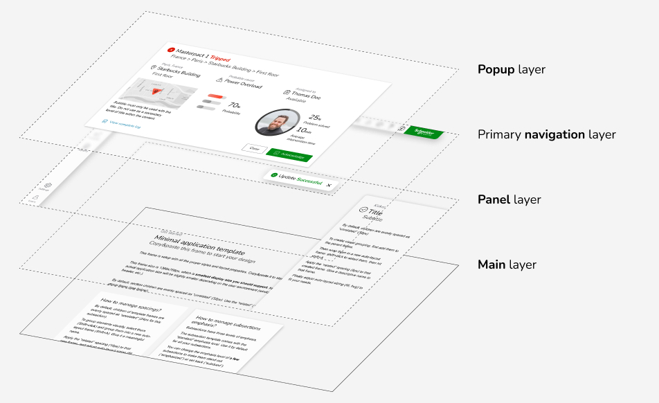
Quartz organizes content into four distinct layers. Think of layers as transparent sheets stacked on top of each other:

The four layers of Quartz, from bottom to top: main layer, panel layer, primary navigation layer, and popup layer.
- The main layer holds most of the content. It is the central area of the screen where users will look at the most.
- The optional panel layer contains the secondary content floating above the main content. Panels are boxes always anchored to the sides or bottom of the application, visible at all times. Panels may be related to the main content; they may update depending on the focused content in the main layer.
- The primary navigation layer is floating above the panel layer. It contains the primary navigation bar to the left and the global application toolbar.
- The popup layer is the topmost layer. It displays dialog boxes, notifications, and onboarding popups. When a dialog box is modal, the background is blurred to prevent user action behind
The main and panel layers are the most useful for organizing content. The popup layer holds transient content.
Layers in practice
Layers are the root of many visual styles: background colors, spacings, elevation, and corner radius.
Nested hierarchy
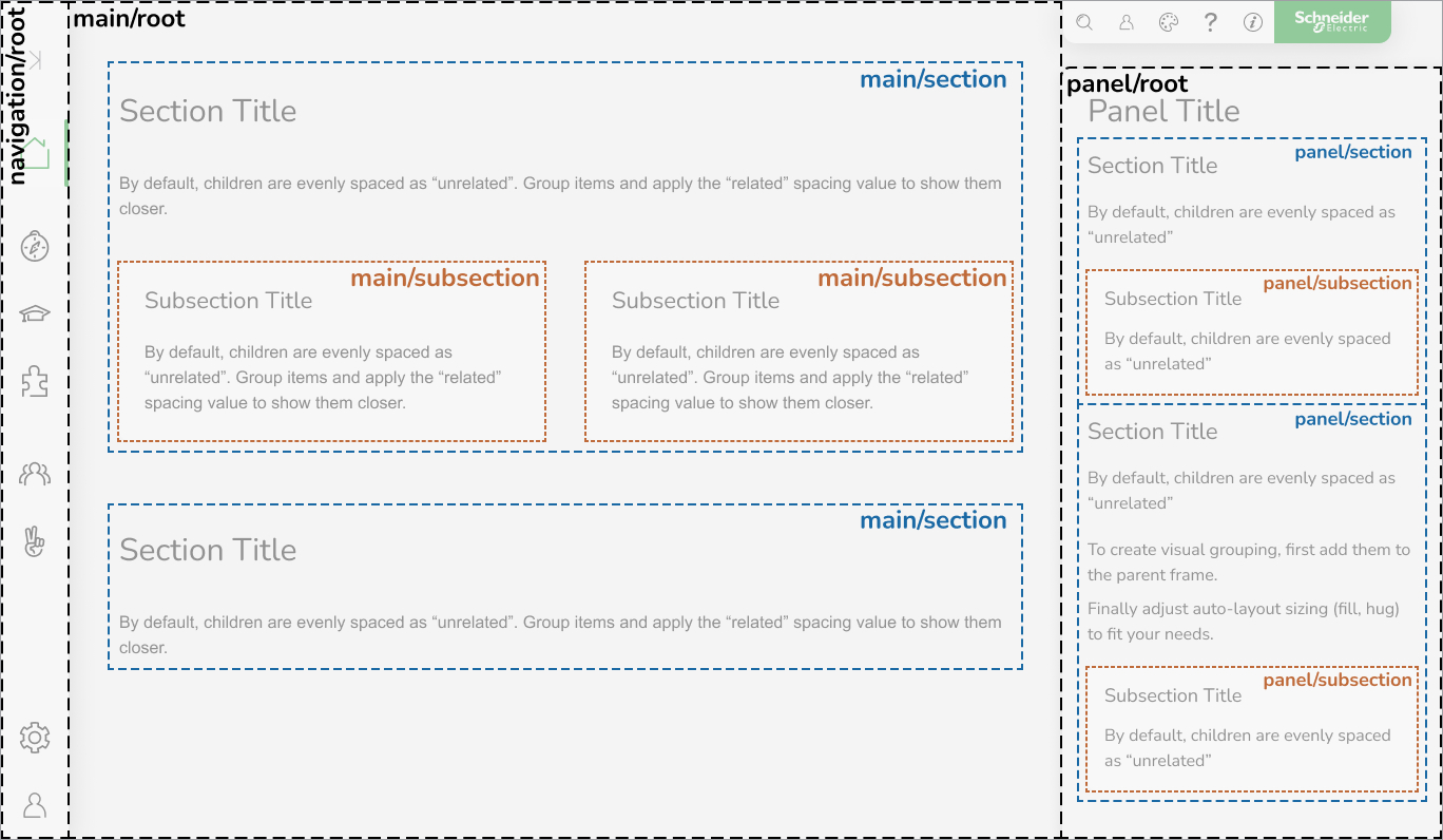
Depending on the layer, Quartz supports up to three levels of nested content hierarchy. These levels are composed of root, sections, and subsections:

Example of layer content breakdown into sections and subsections.
- the root of the layer holds introductory content and an optional top-level title (depending on the layer, see the allowed layer/level combinations).
- the sections are the primary content organization level. They may display titles that help the user scan through the high-level topics.
- within sections, subsections organize the content with more granularity. They may display titles and support special capabilities like importance levels and interactivity.
Because each layer has a specific purpose, not all levels make sense on every layer. See below the allowed layer/level combinations.
Levels in practice
Sections/subsections extend the layer styles and depict how content organizes on multiple levels.
Allowed layer/level combinations
The root/section/subsection hierarchy is the foundation of the Quartz content organization. But those levels are not meaningful on all the layers. The following table shows which levels are allowed on the layers:
| Main | Panel | Primary navigation | Popup | Accessory | |
|---|---|---|---|---|---|
| Root * | 🚫 | ✅ | 🚫 | ✅ | ✅ |
| Section | ✅ | ✅ | ✅ | ✅ | ✅ |
| Subsection | ✅ | ✅ | ✅ | ✅ | 🚫 |
Titles mimic the content hierarchy
The qds-title component mimics the content hierarchy through its
layer and level properties. By keeping those properties coherent with
their parent container, you will ensure all the styles respect the visual
language of Quartz.
Importance hierarchy
The importance hierarchy is only available at the subsection level. Subsections support the three emphasis levels defined by the importance transversal principle:
Examples of the three levels of subsection importance: subdued, standard, and emphasized.
Interactive subsections
A subsection as a whole can be an interactive content block:
It can contain textual content as well as interactive elements like this button:
Subsection examples: the regular subsection can contain a button, but the interactive subsection contains only static content.
Content hierarchy guidelines
Respect the layer/level combinations
Do not mix styles or titles from different layers. Breaking the hierarchy will lead to inconsistencies in the visual language and the overall rhythm of the UI.
Sections are mandatory
Except for introductory material, all content must be wrapped in a section, even if you omit the title of that section. Sections don't have a visible background but have specific spacing rules that must be respected.
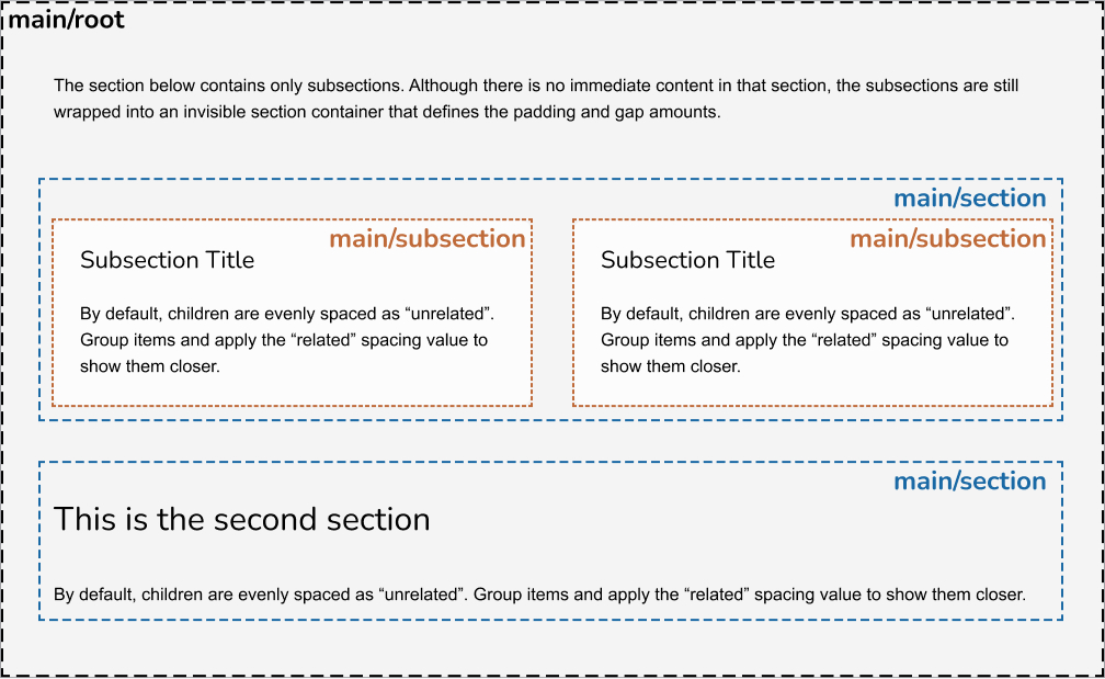
Sometimes, a section contains nothing but subsections. This is okay, but you must still wrap those subsections into an empty parent section. This will ensure proper spacing between the main blocks of your content.

In this example, the first section only contains subsections without any other content. Wrapping them in a section is still required to apply proper spacing. The second section displays a title and sample content.
Titles are optional
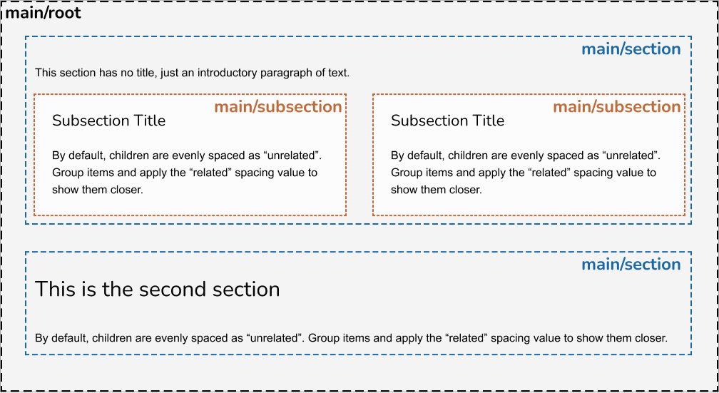
Although titles play a significant role in organizing the content hierarchy, they're not strictly required on your content. For example, within a section, you may omit its title but still use titles for its subsections:

In this example, the first section only contains an introductory paragraph without a title. Wrapping them in a section is still required to apply proper spacing. The second section displays a title and sample content.
Subsections are optional
Subsections allow to break down the content into smaller parts within a section. Not all sections may need that, and it's perfectly valid for a section not to have subsections.
Don't nest subsections
Quartz provides three levels of content hierarchy (layer root, section, subsection). Don't nest sections within sections, or subsections within subsections, to add more levels.
Subsection guidelines
Don't treat subsections as "cards"
Quartz does not provide a "card" component on purpose. Used inappropriately, cards can lead to a confusing visual hierarchy. Stick to following the content-first approach and use the proper Figma templates and utility classes.
Don't emphasize subsections to make them look elevated
Elevation is used to add emphasis to a subsection, meaning it emphasizes its content. Don't emphasize subsections for decorative purposes.
Don't emphasize all the subsections from the same group
Follow the guidelines explained in the importance transversal concept. Typically, don't apply the same level of importance to all subsections from the same group.
Don't include controls within interactive subsections
When a subsection is made interactive, treat it as a uniform content block. Don't add interactive elements inside an interactive subsection. This would create an inconsistent behavior depending on the location of the click/tap.
Specifications
See the content hierarchy specifications page for detailed specifications.