Relationships

Consistent spacing of elements based on their relationships.
About spacing
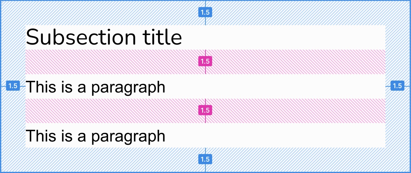
Spacing is key for good visual balance. There are two types of spacing applying from the content hierarchy sections and subsections down to groups of controls:
- the padding inside elements
- the gap between elements

The two types of spacing: padding in blue hashed lines, gap in pink hashed lines.
Padding
Padding is predefined in the components and the content hierarchy templates; don't change it.
Check the specifications page if you need the exact values to build custom components.
Gap relationships
Quartz uses the relationship concept to define the amount of gap between elements. They can relate in two ways:
- they are unrelated: this is the default level; all items relate equally.
- they are related: they relate to each other more than their siblings.
It has no specific relationship with its siblings.
Example of spacing relationships applied to subsections from the main layer.
Example of spacing relationships to create a group of controls.
Check the specifications page if you need the exact values to build custom components.
In the content hierarchy
The content hierarchy defines both padding within its elements and gap between them.
In Figma
In code
The qds-<layer>-<level> utility classes sets the proper amount of padding
and apply the unrelated gap amount between their children:
<div class="qds-main-section xl:flex-row w-full items-stretch">

  <div class="qds-main-subsection">
    <qds-title layer="main" level="subsection" subtitle="Unrelated to its siblings">
      A subsection
    </qds-title>
    <p>A paragraph unrelated to its subsection siblings.</p>
    <qds-button text="Unrelated button"></qds-button>
  </div>

  <div class="qds-main-subsection">
    <qds-title layer="main" level="subsection" subtitle="Unrelated to its siblings">
      A subsection
    </qds-title>
    <p>A paragraph unrelated to its subsection siblings.</p>
    <qds-button text="Unrelated button"></qds-button>
  </div>

  <div class="qds-main-subsection">
    <qds-title layer="main" level="subsection" subtitle="Unrelated to its siblings">
      A subsection
    </qds-title>
    <p>A paragraph unrelated to its subsection siblings.</p>
    <qds-button text="Unrelated button"></qds-button>
  </div>
</div>
To set a related gap between siblings, wrap them in a <div> with a flex
layout and apply the qds-related utility class:
<div class="qds-main-section xl:flex-row w-full items-stretch">

  <div class="qds-main-subsection">
    <qds-title layer="main" level="subsection" subtitle="Unrelated to its siblings">
      A subsection
    </qds-title>
    <p>A paragraph unrelated to its subsection siblings.</p>
    <qds-button text="Unrelated button"></qds-button>
  </div>

  <div class="flex qds-related">

    <div class="qds-main-subsection">
      <qds-title layer="main" level="subsection">
        Related subsections
      </qds-title>
      <div class="flex flex-col qds-related">
        <p>This paragraph is related to the button.</p>
        <qds-button text="Related button"></qds-button>
      </div>
    </div>

    <div class="qds-main-subsection">
      <qds-title layer="main" level="subsection">
        Related subsections
      </qds-title>
      <div class="flex flex-col qds-related">
        <p>This paragraph is related to the button.</p>
        <qds-button text="Related button"></qds-button>
      </div>
    </div>

  </div>
</div>
With controls
In Figma
In code
The qds-controls-<size> utility classes apply the unrelated gap amount
between their children:
<div class="qds-controls flex-row">
  <qds-button text="Three"></qds-button>
  <qds-button text="Unrelated"></qds-button>
  <qds-button text="Buttons"></qds-button>
</div>
To set a related gap between siblings, wrap them in a <div> with a flex
layout and apply the qds-related utility class:
<div class="qds-controls w-full flex-row justify-between">
  <qds-button importance="subdued" text="Options..."></qds-button>
  <div class="qds-related flex flex-row">
    <qds-button importance="emphasized" text="Confirm"></qds-button>
    <qds-button text="Cancel"></qds-button>
  </div>
</div>