Typography is a means of visually communicating and conveying the purpose and message of an application.
An appropriate typographic style and visual hierarchy helps in presenting the most important content which guides users toward the most relevant information.
Fonts
Signature font
The standard font for all digital applications is Nunito.
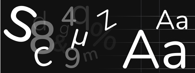
The simplicity of Nunito ensures that typographic style does not hinder our content and message. The font's rounded aspects add a softer, human feel, and echo the style of our pictographic language:

Nunito is used in application names, content titles, and components across all platforms and devices.
See the Brand identity setup page for details about how to set up and use Nunito in your projects.
System fonts
System fonts are fonts that are already loaded in users' device, which has several benefits:
- they are optimized for legibility on their target devices
- they are neutral and familiar to the reader, which is ideal for prose content
- they do not need to be downloaded, reducing the footprint of the application.
The font actually used depends on their operating system:
- on iOS, iPad OS, macOS and tvOS: SF Pro, a neutral, flexible, sans-serif typeface, supporting over 150 languages across Latin, Greek, and Cyrillic scripts.
- on Android: Roboto, optimized for a more natural reading rhythm, supporting Latin, Greek (partial) and Cyrillic scripts.
- on Windows: Segoe UI, an extended sans-serif font family supporting many different languages.

Preview of the main system fonts (SF Pro, Roboto, Segoe UI).
Special cases
- Arial Rounded MT Pro
Used for the se.com web platform only. Never use Arial Rounded and Arial in other digital content. See the Typography page on the global brand portal for more about Arial Rounded MT Pro . - Noto fonts
When Nunito is not supported for your targeted language (e.g. Arabic, Chinese, Cyrillic, Greek, Korean, Thai, etc.), you can use the Noto fonts as an alternative.
Paragraph styles
Following the correct paragraph styles not only results in a pleasant looking block of text, it is also easy to read.
Paragraph alignment
Never justify the text. For Latin alphabet, prefer left-alignment to centered alignment and use full line breaks between paragraphs.
Let all these things just sort of happen. Automatically, all of these beautiful, beautiful things will happen. Each highlight must have its own private shadow. The sun wouldn't forget them.
Let all these things just sort of happen. Automatically, all of these beautiful, beautiful things will happen. Each highlight must have its own private shadow. The sun wouldn't forget them.
Spacing
The leading (line height) has been defined to keep the alignment on our 4 px grid. Do not change the leading and tracking values.
Let all these things just sort of happen. Automatically, all of these beautiful, beautiful things will happen. Each highlight must have its own private shadow. The sun wouldn't forget them.
Let all these things just sort of happen. Automatically, all of these beautiful, beautiful things will happen. Each highlight must have its own private shadow. The sun wouldn't forget them.
Let all these things just sort of happen. Automatically, all of these beautiful, beautiful things will happen. Each highlight must have its own private shadow. The sun wouldn't forget them.
Body text line length
In order to avoid the drawbacks of too long and too short lines, we suggest keeping your text within the range of 45 – 90 characters per line including spacings.
Use the qds-max-w-prose utility class from the optional
@quartzds/tailwind-preset package to get automatic character-based width
(see example below).
Let all these things just sort of happen. Automatically, all of these beautiful, beautiful things will happen. Each highlight must have its own private shadow. The sun wouldn't forget them.
Let all these things just sort of happen. Automatically, all of these beautiful, beautiful things will happen. Each highlight must have its own private shadow. The sun wouldn't forget them.
Let all these things just sort of happen. Automatically, all of these beautiful, beautiful things will happen. Each highlight must have its own private shadow. The sun wouldn't forget them.
Titles
Titles can be used at the top of most content groupings inside the screen.
Quartz provides the Title component which takes care of the formatting and sophisticated layout of titles, including multiline content and proper icon positioning.
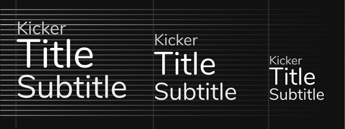
A title group is made up of:
- the mandatory title summarizes the related content using as few words as possible;
- the optional subtitle gives additional information;
- the kicker is a short phrase that precedes the title, which can be used to present a classification;
- a pictogram can be added on the left of the main title to provide additional visual cues.
Title hierarchy
Rather than providing a flat list of title levels, Quartz organizes titles along the standard content hierarchy at the heart of its visual language. The Title component parameter names and values thus follow this layer/level hierarchy.
From a technical perspective, the Title's tag parameter lets developers
decide which HTML tag is used underneath, independently from the layer/level
settings. This is important to follow the HTML section headings
recommendations enabling good accessibility of headings in a page.
Allowed combinations
- The icon, subtitle and kicker are always used in addition to the title and can be hidden individually.
- Never hide the title while keeping the icon, kicker or subtitle.
Capitalization
- For the title, use normal sentence capitalization.
- Prefer short titles and keep the text on one line as much as possible.
- Avoid ALL-CAPS everywhere or any other form of capitalization.
Emphasis
- Emphasis can only be used on the main title and is forbidden on the subtitle and kicker.
- When emphasizing words, always keep styles to a minimum to avoid interrupting the reader and adding noise.
- Never emphasize the entire title.
Color
- Only emphasized title elements can be colored.
- The only colors allowed are the status colors, as described in the Feedback design patterns page.
- Never use more than one status color per title.
- If the title conveys a status, the icon can take the status color.

Status color applied on the emphasized title words and associated icon.


