Brand signature

Schneider Electric's visual identity is more than just a logo. It is a collection of graphical elements with specific meaning that, brought together, create a cohesive brand visual signature. This signature is transversal to all Schneider Electric products.
Life is On
Everything starts with our brand essence: Life is On
Schneider's purpose is to empower everyone to make the most of our energy and resources, bridging progress and sustainability for all. At Schneider, we call this Life Is On.
To define a systematic visual language, we started with the Life is On representation. Broken down into its key visual elements, we have the Life Green, the Circle, and the Line.

The Life Green, the Line and the Circle elements from the Life Is On representation.
These simple shapes are present in all Schneider Electric applications, and, with the logo, form the core signature elements. These core signature elements create a strong and coherent visual landscape, not only between applications but between hardware and software products.
Signature elements
Core elements that define a Schneider Electric application.
Badge
The badge creates a consistent brand presence inside desktop, tablet and mobile applications, and includes the brand logo:
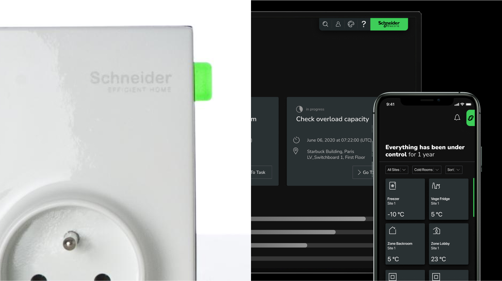
Examples of the badge on a physical product, a desktop application, and a mobile application.
When the logo is clickable or interactive in the application header, it is included in a clickable badge.


Interactive logo label when part of the header menu on light and dark themes.
On mobile devices, the logo is placed in an interactive balloon:

Line
The line is used to signify the transition or connection on the screens. It always shows the users where they are.
Therefore, it is used for components like tab navigation sliders and loading bars.
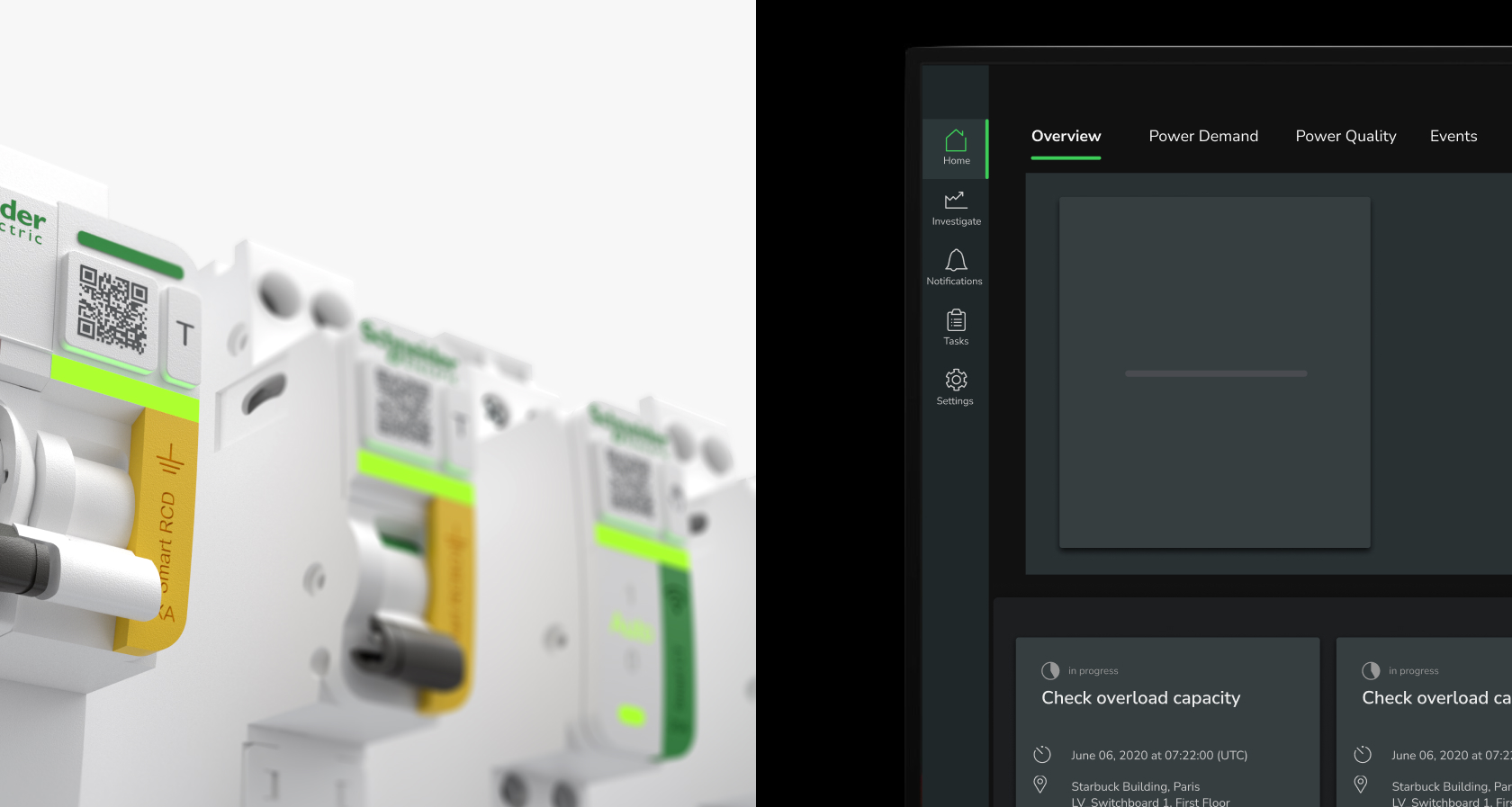
Parallel between hardware (on the left) and software (on the right)
Circle
The circle is used to signify the status of the system or an element of the system. It always shows the user how things are.
Therefore, it is used for components like status indicator, criticality indicator and stepper.
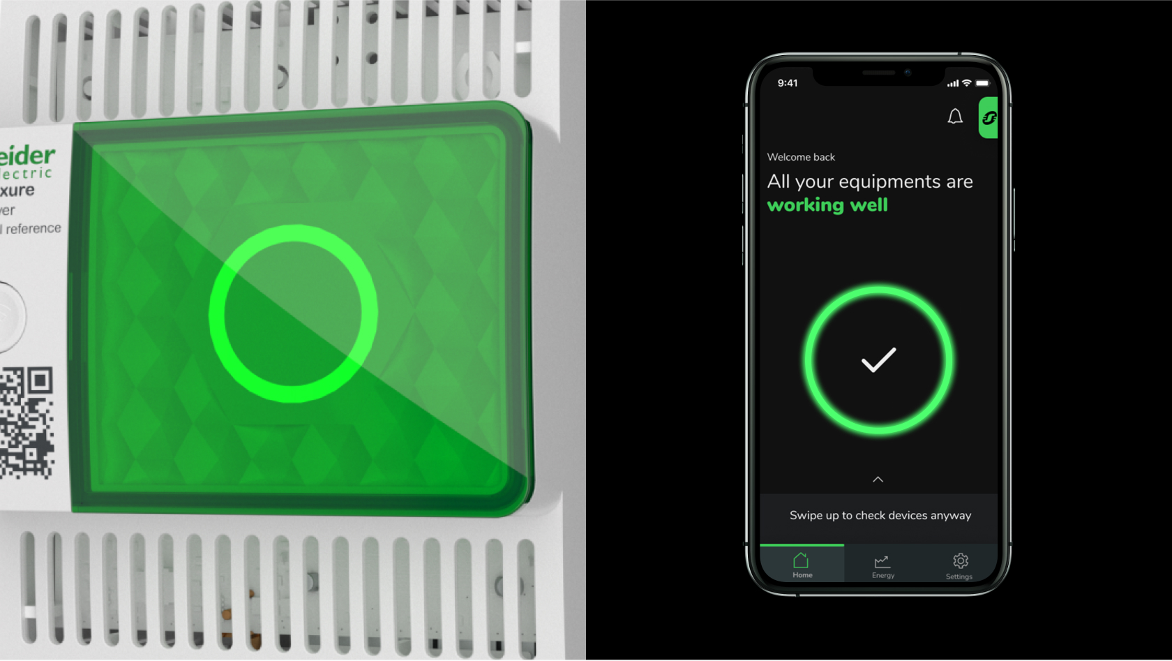
Parallel between hardware (on the left) and software (on the right)
Triangle
Even if the Electric Shadow pattern is not used in digital applications, the triangle shape has been isolated to point to certain elements of the interface. It indicates to the user where the related element is.
Therefore, it is used for tips of tooltips, pins on maps and pointers in various visualizations.
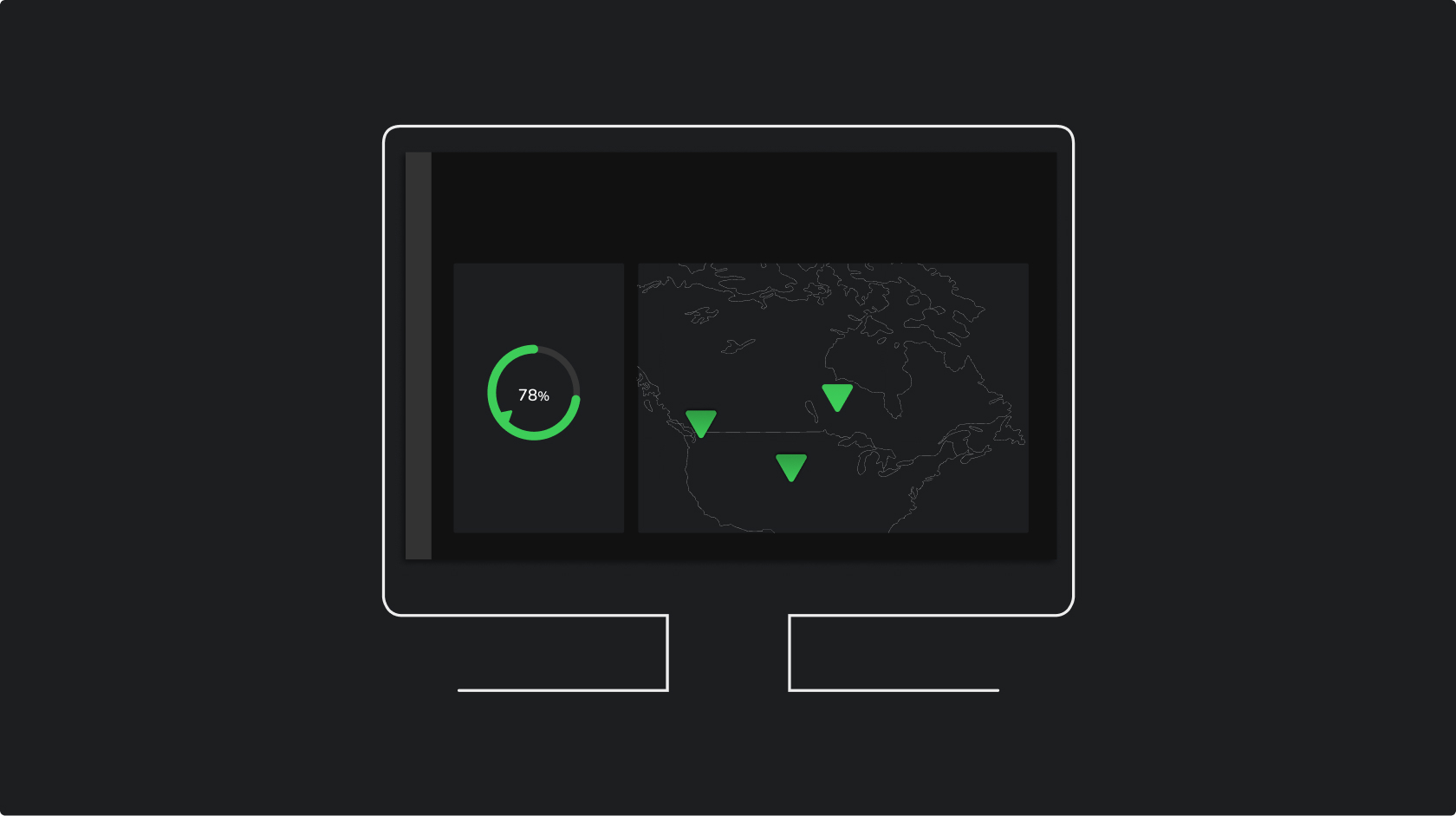
The triangle indicates to the user where the related element is.
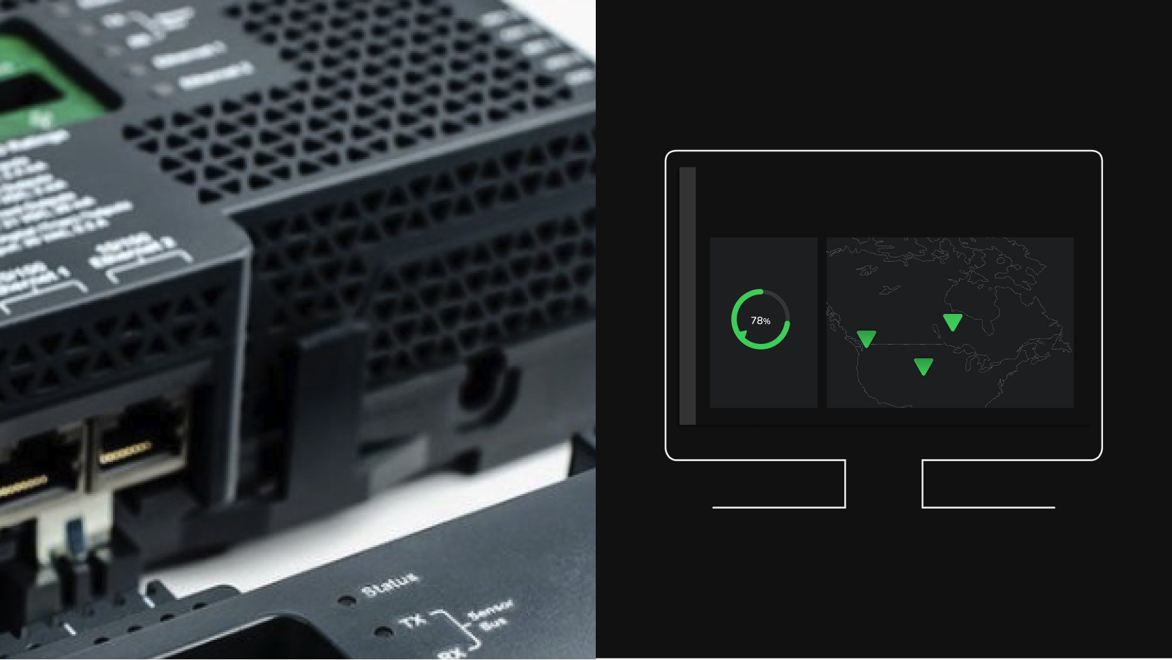
Parallel between hardware (on the left) and software (on the right)


